

Brand Guidelines
Nordic brand — the brand identity and official brand book of Nordic International University: name, logo, colours and typography. One source for everyone doing branding for the university.
Nordic brand guidelines — this page is built from the university's official “Visual Brand Guidelines” brand book. It sets out how the brand is named, how the logo is applied, which colours and typefaces are used, and in what style visual material is produced. All logo files can be downloaded at the end of the page.
Name
The university's name exists on several levels: the legal entity, the institutional name and the brand. In most cases the brand name is used.
Order of use
- 1Nordic International University (Xalqaro Nordik universiteti)
- 2Nordic International University
- 3Nordic / Nordik
Do's and don'ts
- Nordic International UniversityNordic University
“Nordic University” is misleading: it implies direct descent from, or relation to, the Nordic countries. “International” adds the layer of internationality and legitimises the Nordic element.
- Nordic International University (Xalqaro Nordik universiteti) presents a new programmeXalqaro Nordik universiteti presents a new programme
When the institutional name is transliterated into another language, the brand name must not be omitted.
- Nordic International UniversityUniversity “Nordic International University”
The branded name already represents both the brand and the legal entity — prefixing “university” is redundant.
Subsidiary naming
A unit's name always follows the university's name. In academic departments “Department” precedes the subject; in executive departments it follows.
University | [Department] + SubjectUniversity | Subject + [Department]Motto
Facta non fata — “deeds, not luck”.
The motto is (a) a guiding piece of organisational direction and (b) an element of identity. Its symbolic motif is traced from the university's existing direction towards underscored proactivity.
The theme of proactivity is to permeate the organisation — from staff to faculty and academic affairs. The main address is to students, underscoring academic performance and the acquisition of knowledge.
Logo
The logo has two parts: the “UN” mark drawn with four parallel lines, and the wordmark set in Roboto Serif Classic. The mark is constructed on a 24× modular grid.
Pictorial mark
The letters “U” and “N” are drawn with four parallel lines in a single rhythm. The diagonal of the “N” grows out of the “U” and binds the letters into one form.
Construction: the mark is based on a 24× grid — stroke weight, spacing and radii are multiples of the module. The mark must never be redrawn or reproportioned.
Brand metaphors
A swan in flight — the wing-like lines of the mark carry lightness, long distance and the image of northern nature.
The Øresund Bridge — a structure joining the Nordic countries. The parallel lines, like bridge cables, connect two shores: education in Uzbekistan and in Northern Europe.
Logo lockups
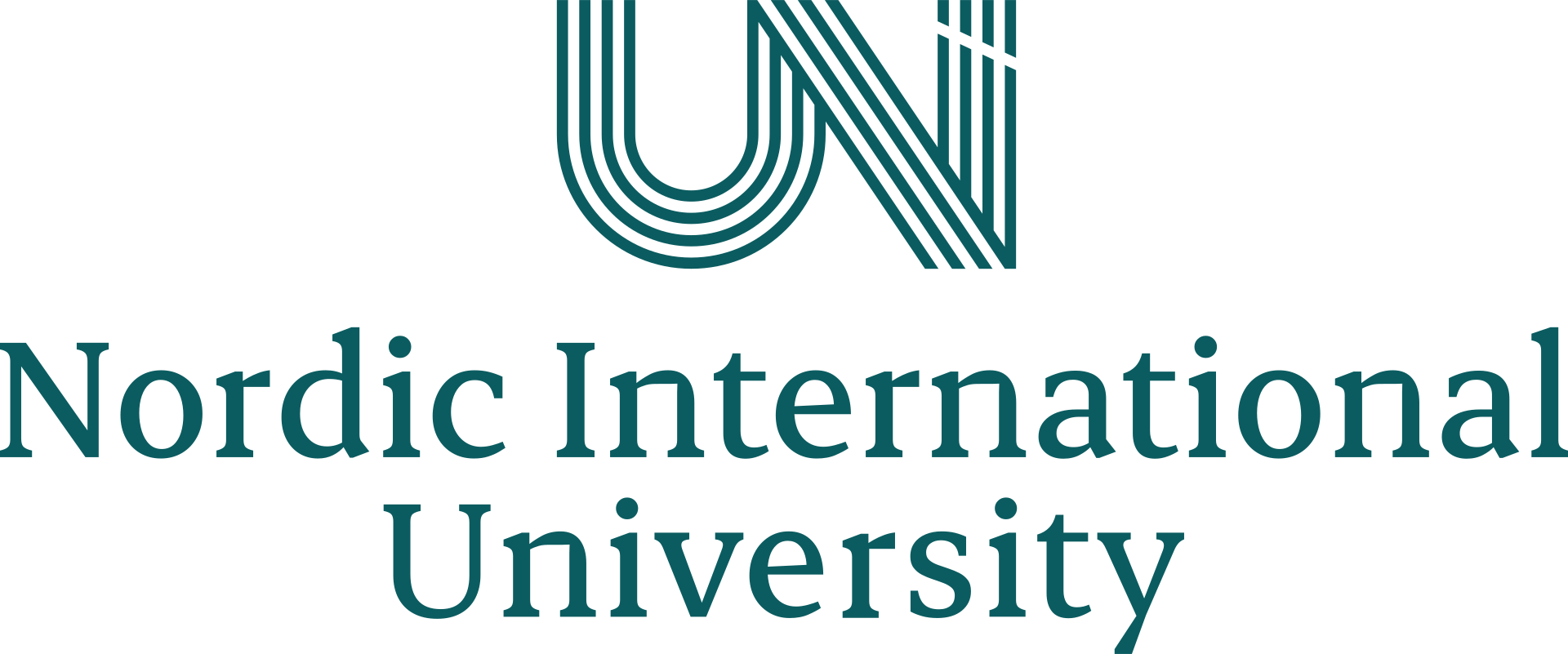
The primary and preferred version. Mark above the wordmark, centred.

When the stacked version is unfeasible: narrow horizontal spaces, header rows.
Where the brand is already recognised: social avatars, favicon, small print.
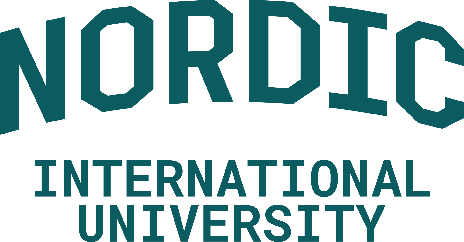
Arched lettering for sports and merchandise. Not used on official documents.
On backgrounds
On dark backgrounds (Hornavan, Tundra, Borealis, Obsidian) the logo is white; on light backgrounds (white, Milky Beige) it is Hornavan Green.
Key rules
- Stacked is the primary version; aligned only when stacked does not fit.
- The logo appears only in Hornavan Green or white — it is never recoloured.
- Proportions of mark and wordmark are fixed: no stretching, squeezing or rotating.
- The wordmark is never reset in another typeface or separated from the mark.
- Keep clear space around the logo — no other element may touch it.
- Use only the official files — never screenshots or redrawn copies.
Colours
The palette is drawn from northern nature: one main colour, four backgrounds and four accents. The colour names refer to Scandinavian landscapes.
Main
Backgrounds
Accents
Colour sources
Each pairing is taken from a specific landscape — which is why they look natural together.
Colorways
A colorway is defined by the background colour and its primary or accent pairing. The combinations below are the permitted ones.
Typography
The brand uses four typefaces, each with a defined role. Serif for headlines, sans for text — that contrast is the backbone of the identity.
The quick brown fox jumps over the lazy dog. 0123456789
Titles, headlines and key short text. No bold cut is used — Medium is the heaviest weight.
The quick brown fox jumps over the lazy dog. 0123456789
Body paragraphs, long-form text, interface — any text that is not a title.
The quick brown fox jumps over the lazy dog. 0123456789
Where a sans serif is not applicable: editorial and non-digital media, long-form reading.
The quick brown fox jumps over the lazy dog. 0123456789
The university's entities demanding decorum: certificates, diplomas. Never for titles or running text.
Type scale
X is the headline size; every other level is derived from it by ratio.
Optical alignment
The fonts' x-heights should match, with em-sizes calibrated optically. Optically aligned Crimson Pro is about 1.3× the Finlandica equivalent. Finlandica Text Regular is equivalent in typographic contrast to Crimson Pro Light.
Font pairings
Moodboards are needed to concisely communicate both the aesthetic appeal and the functional imperative of the typesetting. WSJ, The New York Times and Bloomberg are great contenders to inspire visual design.
Moodboards are needed to concisely communicate both the aesthetic appeal and the functional imperative of the typesetting. WSJ, The New York Times and Bloomberg are great contenders to inspire visual design.
Moodboards are needed to concisely communicate both the aesthetic appeal and the functional imperative of the typesetting. WSJ, The New York Times and Bloomberg are great contenders to inspire visual design.
Visual direction
The university's visual style is derived at the intersection of two axes: style (socio-cultural) and genre (visual). Refer to style as a compass, and to genres for direct inspiration.
Direct appeal to the consumer ↔ indirect appeal to institutional frames of reference
Aesthetics of contemporary mass brands ↔ aesthetics of late-modern documents
Aimed at immediate aesthetic gratification: the visual reads instantly and needs no deconstruction. High contrast in colour, low contrast in shapes and strokes.
- bold fonts
- big sizes
- contrasting colourways
- all-caps
- limited negative space
Runs in opposition to kitsch: appreciated through deconstruction, requires educational capital. Limited colours, a generally reserved style.
- generous negative space
- no bold fonts
- muted palette
- reserved composition
The contemporary visual frames of mass-marketed products and digital media. Concordant with the logic of sale and public consumption.
- advertising
- social media
- mass appeal
- contemporary
An aesthetic running contrary to contemporary visual culture — the styles of the 18th–20th centuries. Used in contracts and legally binding documents, hence “contractarian”.
- small-scale print
- display lettering
- arabesque / grotesque
- geometric patterns
- guilloche
Before designing, answer two questions: who is the audience (stakeholder group) and what is the occasion? A student concert poster may lean towards kitsch; a faculty bulletin or a certificate sits with schick and vintage contractarian.
File naming
Every brand file follows one pattern — so it can be found and sorted in any repository.
- 1Organisational affiliation: nordicUniv, nordicSch, nordicJourn
- 2File category / repository: identity, docs, creative
- 3File (capitalised)
- 4Subtag / description / variation
- nordicUniv-identity_LogoLockup
- nordicUniv-docs_IDcard
- nordicUniv-creative_AdvertOutdoor
- nordicSch-creative_AdvertOutdoor
- nordicJourn-identity_Logo
Downloads
The official logo files. Click an image to enlarge it, then download the format you need. SVG for print and large sizes, PNG for presentations and the web.





Fonts
Finlandica, Roboto Serif and Crimson Pro are open-licence (OFL) typefaces, free on Google Fonts. Erode is by Indian Type Foundry and is available through Fontshare.
For questions about brand material, approval of new layouts or additional files, contact the Marketing & PR Department.
Follow Nordic on social media